Writing After the Fall: American End Times Part 2 The Craftsman and His Tools
Let's talk about the writing tools I'll be using. Part 1 of writing After the Fall: American End Times


SteveF (who was the copy editor for Lightning Fall) pointed out that the potential cover I posted yesterday had no real visual connection to the first book’s cover, and he was right. So I went back and took some more shots at it.
Here’s the cover for Lightning Fall that I wasn’t trying to exactly match, but I wanted to rhyme with visually:
The only real characteristics of the cover were its dark blue color, and the stylized lightning bolts meant to indicate the EMP attack that started everything. So, every new prompt for the AI program I created included the words blue and lightning in some form or another.
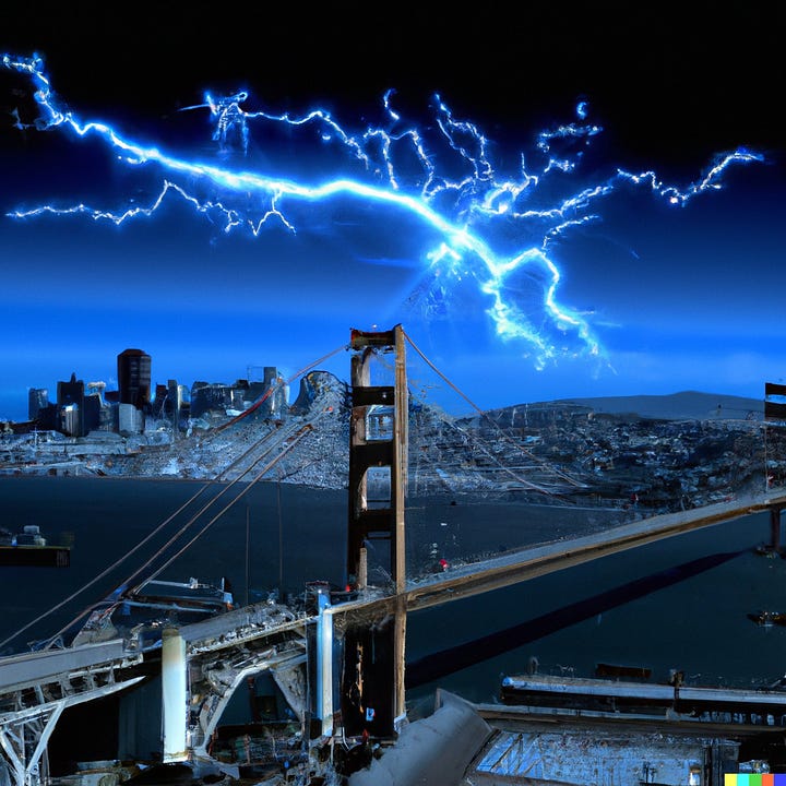
The first aircraft carrier in the top row was made by feeding Dall-E the prompt, “Blue tone Photorealism in the style of H.R. Giger, the aircraft carrier George H.W. Bush on San Francisco Bay at night in a lightning storm with the golden gate bridge in the background digital art 3-D render”
The second aircraft carrier in the top row was created using several iterations of the prompt “H.R. Giger style photorealism, panorama of devastated san francisco, hundreds of lightning bolts filling a blue night sky, golden gate bridge, CVN-77 George H. W. Bush aircraft carrier floating out to sea, digital art, 3-D render”
Now, understand that I had to re-run the creation process several times for each long prompt, with each process producing four unique pictures. I kept punching the create button until I found the two I’m posting here. I personally like the second one better, but it doesn’t work as well as the first for my purposes. It looks cool and weird and science-fictional but the lightning looks like it was spray painted on the sky, and you can’t tell the location - no Golden Gate Bridge, and nothing recognizably San Francisco. It could be almost anywhere. The first one has the right color scheme, the lightning looks better, and that is obviously the Golden Gate in the background. It checks all the boxes, and if I end up using it as the cover, it will do what it’s supposed to do, rhyme visually with the first book’s cover.
I’ll tell you a bit later why I’m placing a certain amount of emphasis on the aircraft carrier.
The first graphic in the upper left corner is the one I made yesterday, about which SteveF commented, “Excellent! Exactly what I was thinking of," which was reassuring, because as it turns out, even after a solid four hours of playing with Dall-E, I never came up with anything I liked better.
Let’s take a look at the two side by side.
Versus:
I have to say that even though I personally like that panorama from the bridge, the aircraft carrier cover works better with the previous cover. What do you think? Also, its three primary colors are red, white, and blue, which ties in with the ethos of this novel as well. Speaking of which, I did produce a more blatantly patriotic piece of cover art, which I also like, but I just don’t think it works for my purposes:
By the way, at this point, nothing is set in stone. I can pretty much predict that either I, or one of you, will come up with something better as this process continues. And that is as it should be. When I write, I am constantly editing in my own mind as I go. Things change, in fact, if they didn’t, the work would probably end up being crap. Some writers need to have everything outlined beforehand, right down to the bedrock of crossed tees and dotted is. I am not one of those writers. For myself, writing is a process of discovery as much as it is one of creation.
Keep reading with a 7-day free trial
Subscribe to Swimming Downstream From the Culture Pool to keep reading this post and get 7 days of free access to the full post archives.


